Work

Case studies.

Current work at uRoof, then systems and product at Gap Inc. and The Home Depot. Click a study to expand.

The problem

Roof replacement is a multi-party workflow sold as a waiting period. Homeowners waited days for a number. Realtors stalled closings. Operators lived in a patchwork of quoting tools, email, and spreadsheets. Each audience invented a different path through the same job.

Role

CTO and co-founder. Accountable for product design, the design system, and the production platform — from Figma tokens to a Next.js / React app in production.
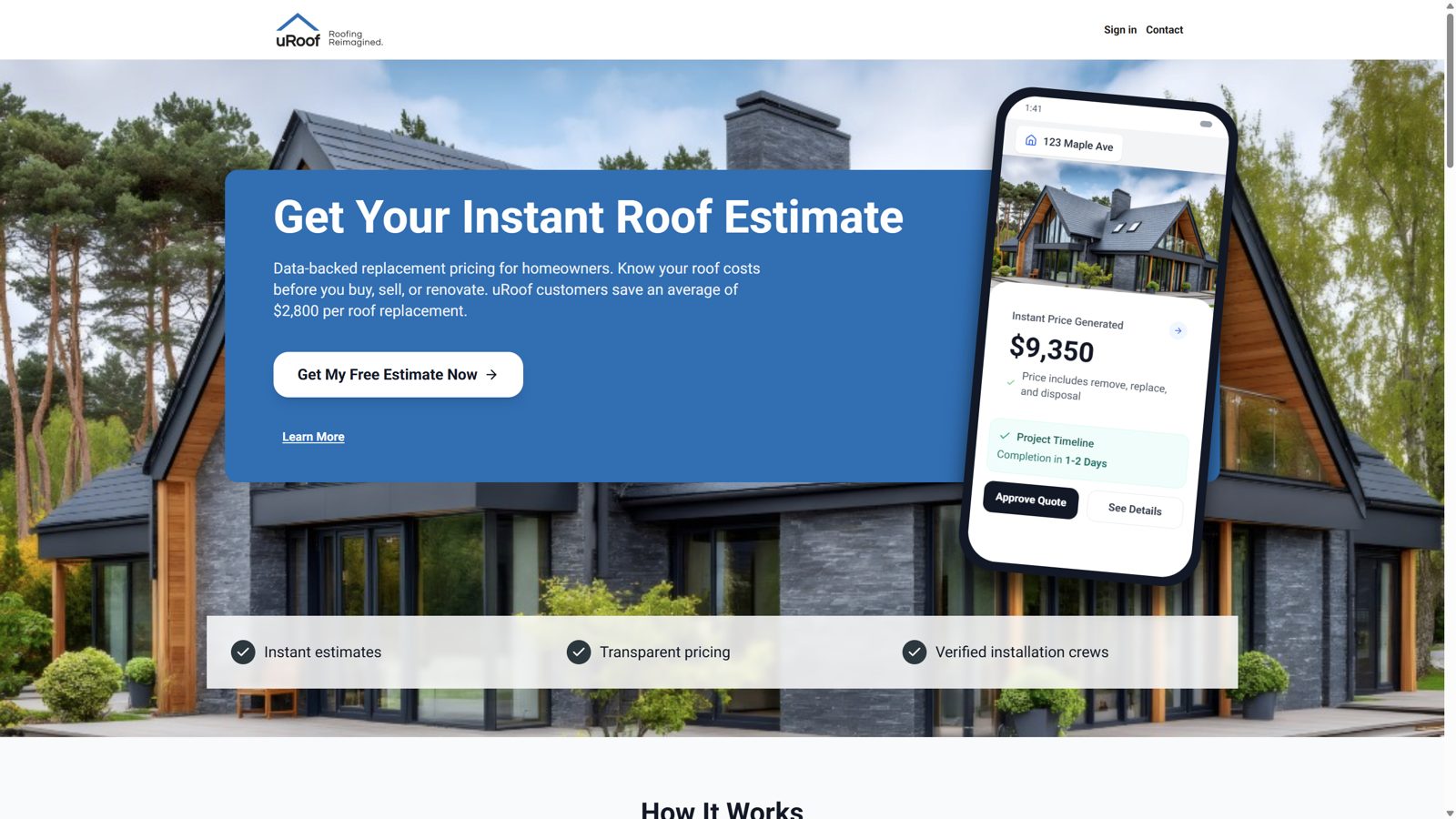
uRoof landing: instant estimate for homeowners

Strategy

  • One intake: address in, price out. Measurement, pricing, and integrations stay behind a form that a homeowner can finish in minutes.
  • The same job, different dashboards — homeowner, realtor, contractor, adjuster, and admin — instead of a single screen that tries to serve everyone.
  • Treat the design system as a product: Figma tokens mapped 1:1 into React for landing, estimator, and admin chrome (tables, pipeline status, search).
  • Retire the fragmented quoting toolchain. A unified portal and a webhook-driven lifecycle: proposal, payment, materials, crew.
  • Design the operator path with the same care as the consumer one: pipeline, troubleshooting, QA “view as role,” and production observability so the team can operate what we ship.
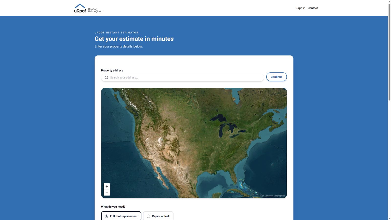
Instant estimator: address, satellite map, replacement or repair

Outcome

The platform is live at uroof.com: instant estimator, partner referral, and the path from price to proposal to crew. The design system is in production on consumer and admin surfaces. The live product has a public status page and an on-call path for production incidents.
The problem

Multi-brand ecommerce at this scale tends toward fragmentation — every brand invents buttons, grids, and content patterns — or a lowest-common-denominator kit that marketing and brand teams will not use. Headless architecture raised the cost of inconsistency: the same UI primitives had to travel across platforms and storefronts.

Role

Senior UX Manager for Headless UI and Design Systems. Accountable for system strategy and execution, centralized resources, and the tooling that made the system usable day to day.

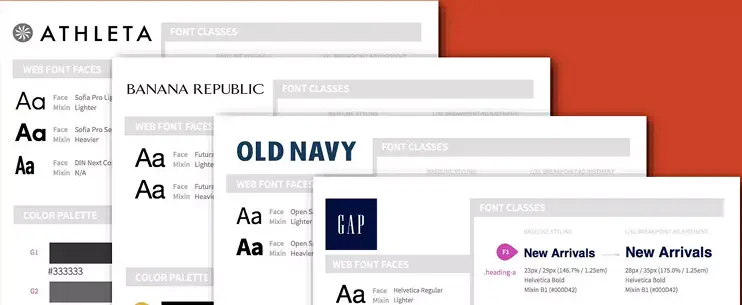
Gap, Banana Republic, Athleta, and Old Navy

Strategy

  • Treat the system as a product for designers and engineers shipping four brands.
  • Separate shared structural UI from brand expression so tokens and components could flex without forking the architecture.
  • Invest in tooling, intake, and ways of working so adoption was the default.

Outcome

The Headless UI design system was established and optimized across Gap, Banana Republic, Athleta, and Old Navy. User-experience metrics improved by an average of 15% across brands. Centralized systems and design-tool practices improved team efficiency and output.

The problem

Customer-facing properties were outrunning shared UI. Inconsistency slowed design and engineering and made every new surface a renegotiation. A system that lived only in Figma — or only in code — would fail. It had to be governed, staffed, and useful to Creative, Marketing, Engineering, and Product at the same time.

Role

UX Manager supporting the creation, implementation, and adoption of Stencil; design-system management and strategy; a multidisciplinary UX team; and people-ops systems for the online UX org.

Strategy

  • Stand up libraries, standards, critique, and a team that could own the system as a product.
  • Tie system investment to speed and sales, not aesthetics alone.
  • Treat adoption as design work: case studies, research, governance, and tooling decisions, including Figma.

The system

Design tokens and a Figma library for UX, mapped 1:1 to coded atomic components for engineering. Guidelines lived with the code so teams were not guessing how or when to use a component.

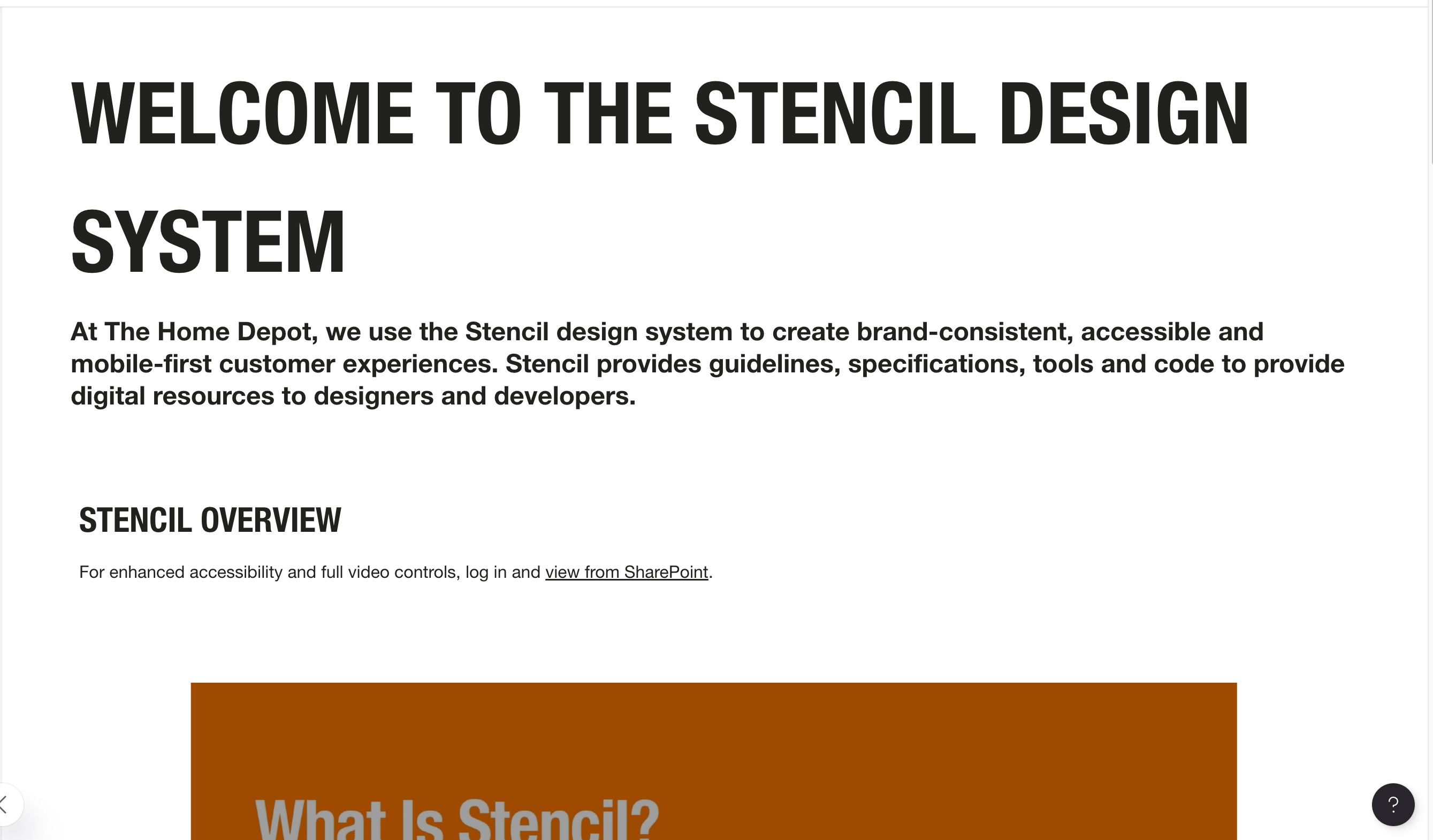
Stencil design system main page
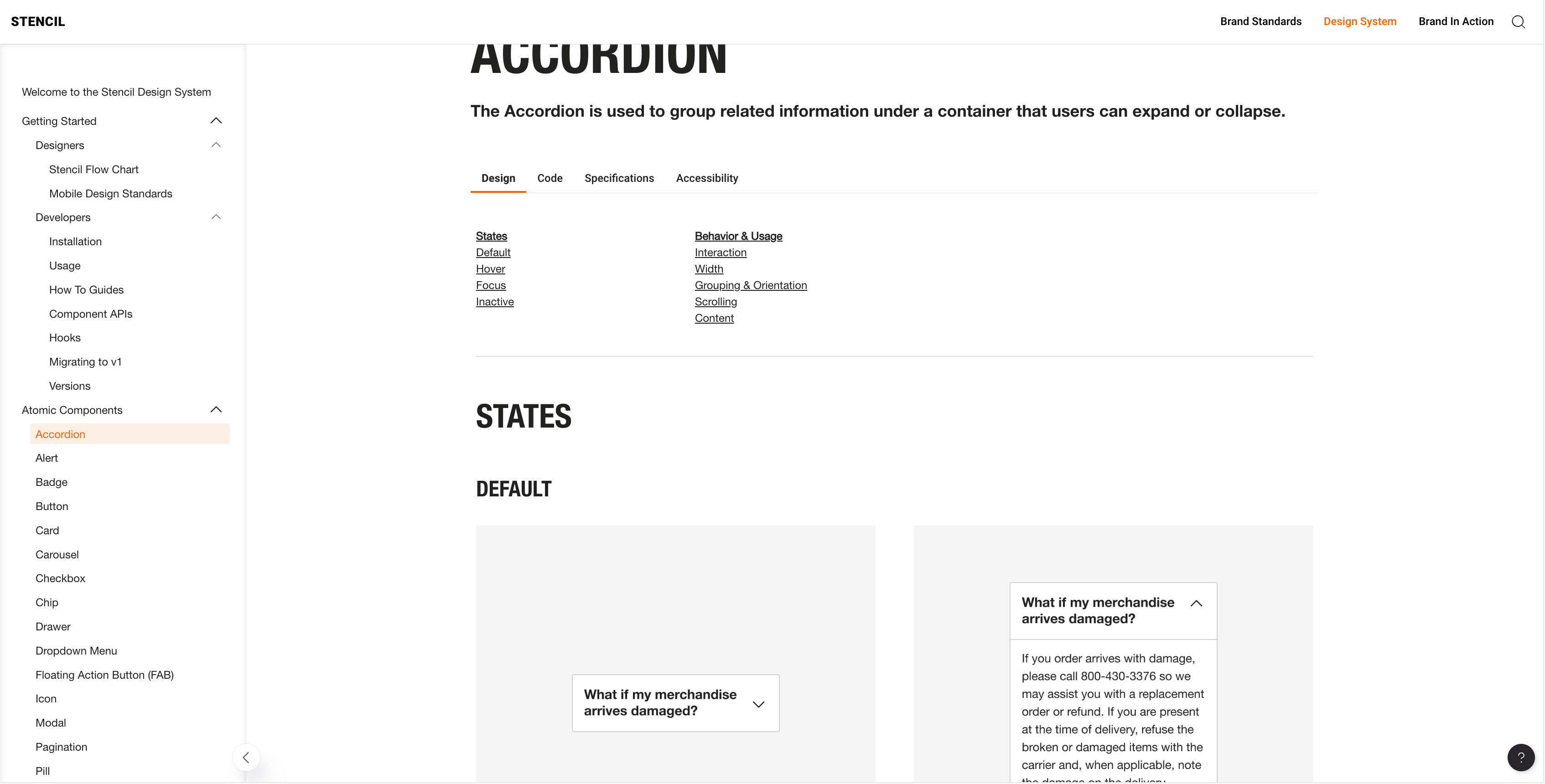
Stencil accordion design content
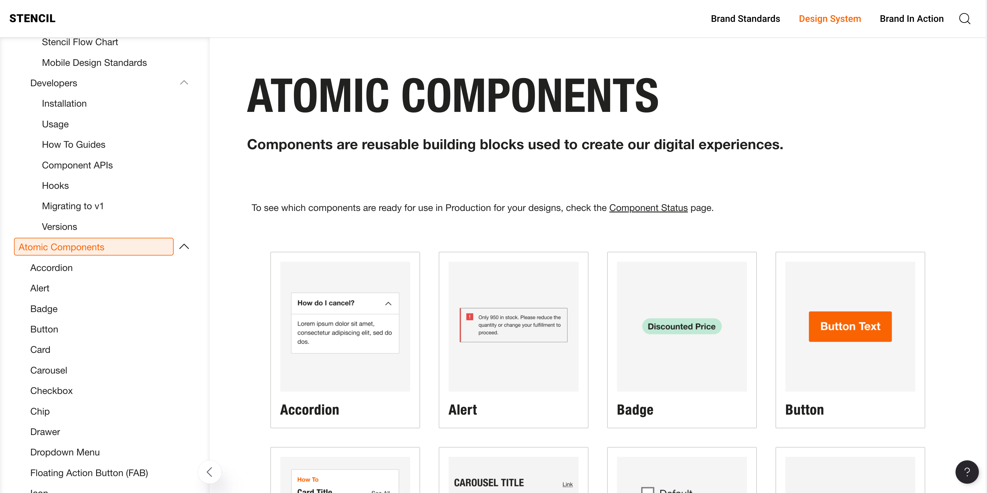
Stencil atomic components
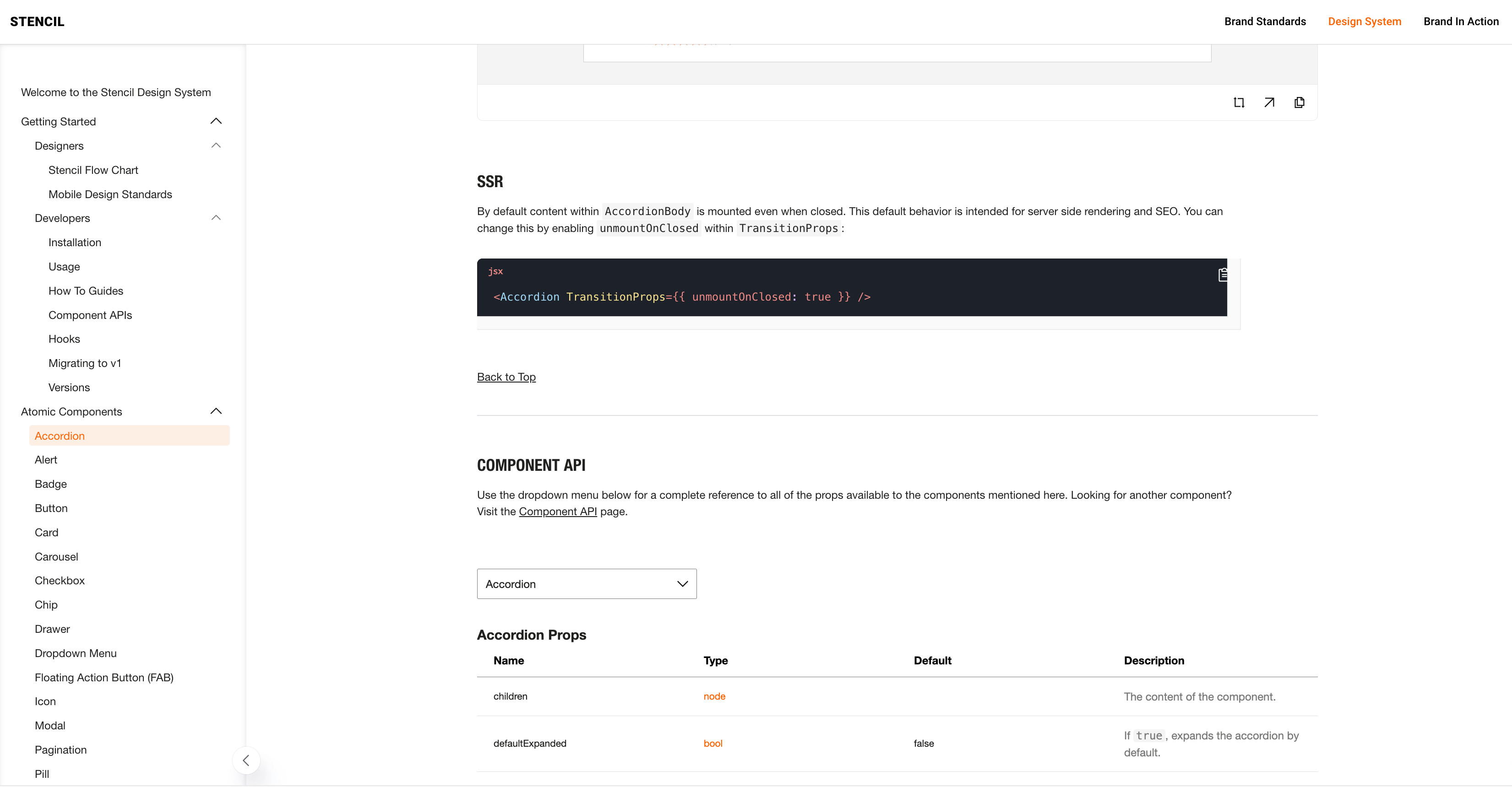
Stencil accordion developer content
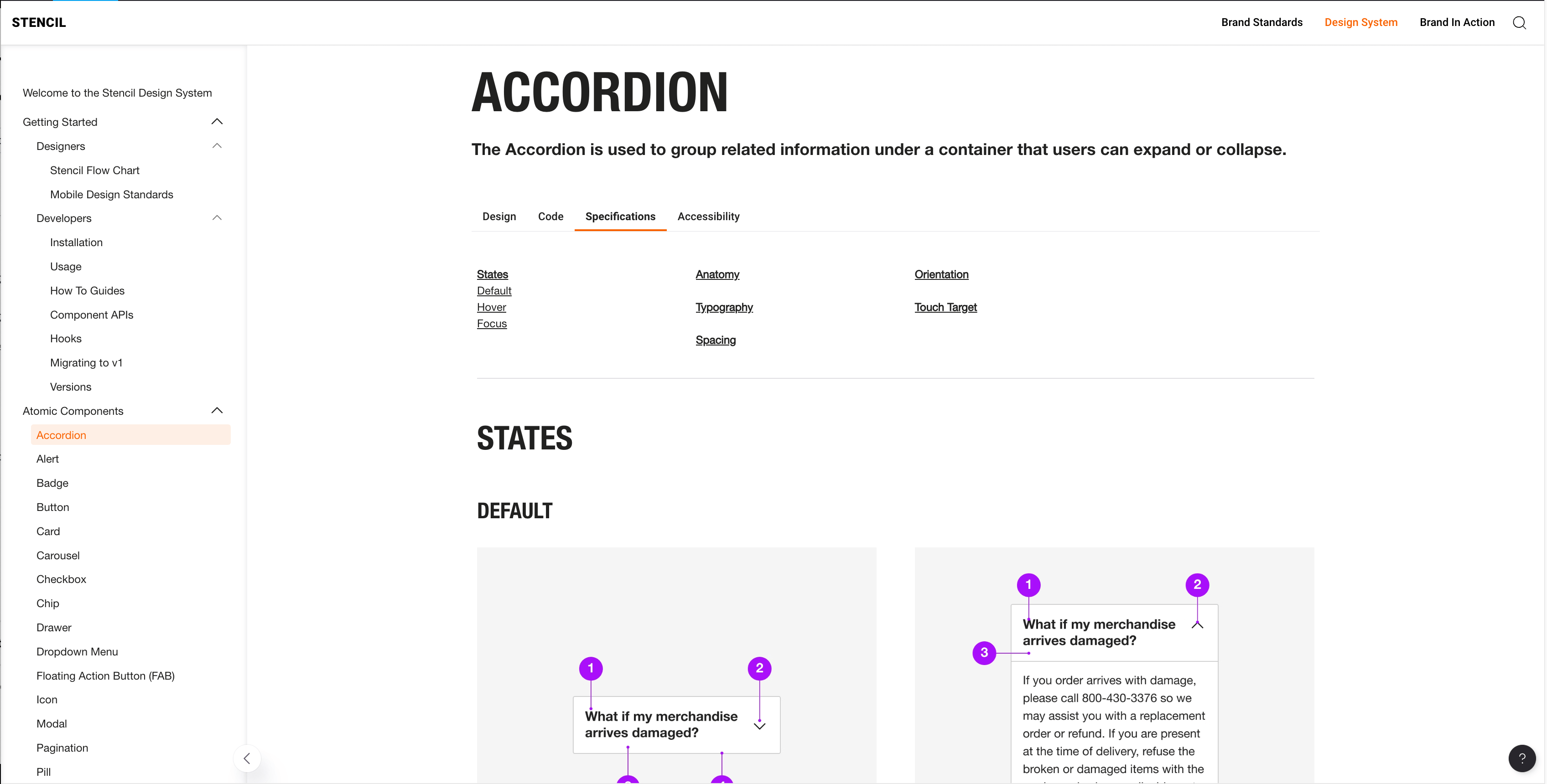
Stencil accordion specs
Stencil business metrics

Outcome

Stencil shipped as the system for customer-facing online properties. The work correlated with a 35% increase in customer sales tickets and a 15% increase in speed to market for design and development.

Home Depot needed any register to run in self-service mode and to retire legacy FUJI self-checkout software. This was a multi-million-dollar program with incremental funding.

The problem

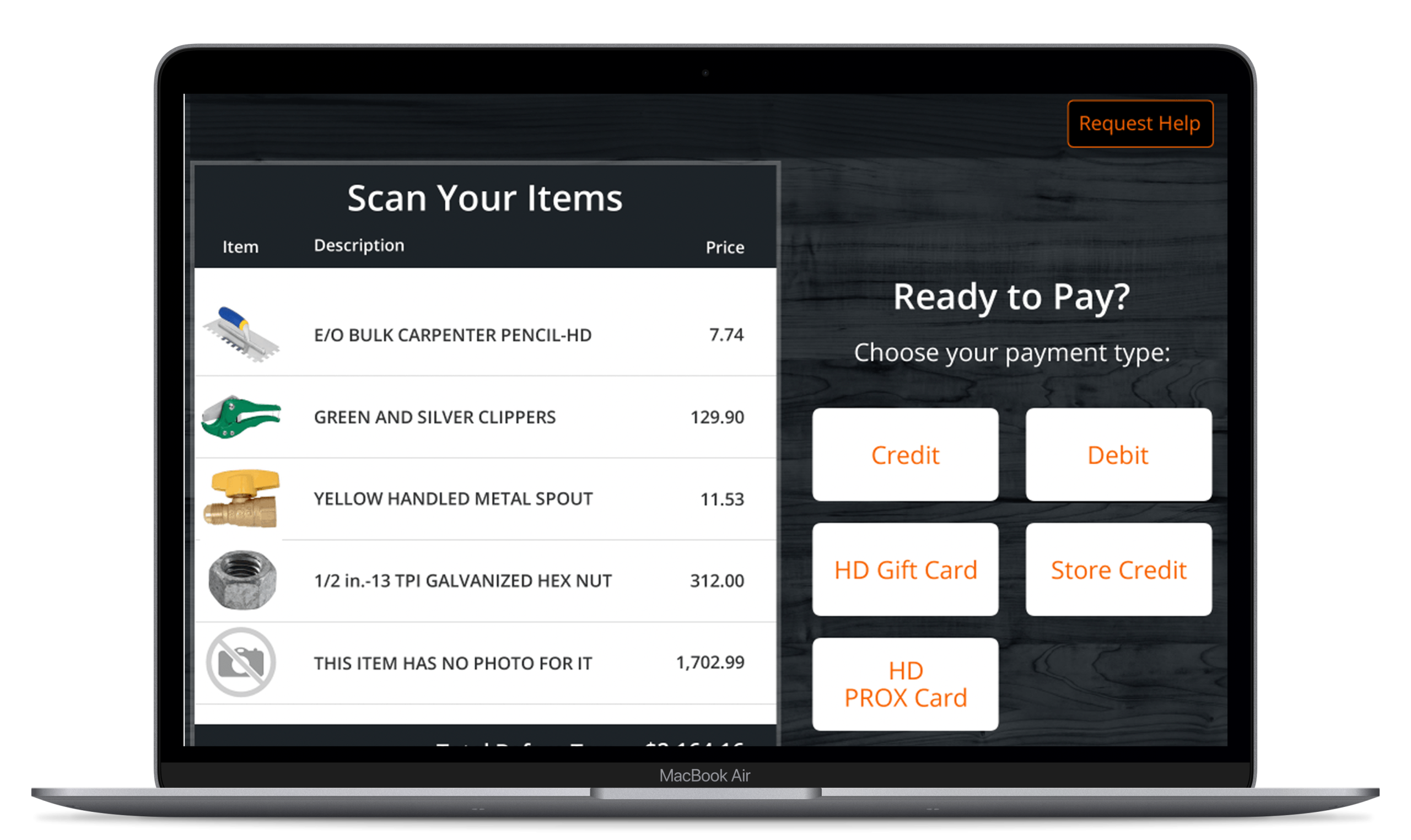
Self-checkout fails when it is slow, confusing, or unable to handle a home-improvement basket. Replacing an entrenched vendor platform meant the experience had to survive hardware constraints, associate override, and a rollout measured in stores.

Role

UX consultant and later design leadership on the program: research, interaction design, and iteration inside Store Systems, in a 200+ UX organization, with engineering and operations.

Strategy

  • Design exception paths — overrides, help, and associate intervention — with the same care as the happy path.
  • Replace the FUJI platform with a coherent application, not a visual skin.
  • Support incremental funding with evidence from store use.
Self-checkout implementation

Outcome

The replacement self-checkout application shipped and is in use in stores nationwide.

Receiving freight in a Home Depot store is operational UX: associates on a mobile device, on the clock, with trucks waiting on the decision. The existing application was a retirement candidate.

The problem

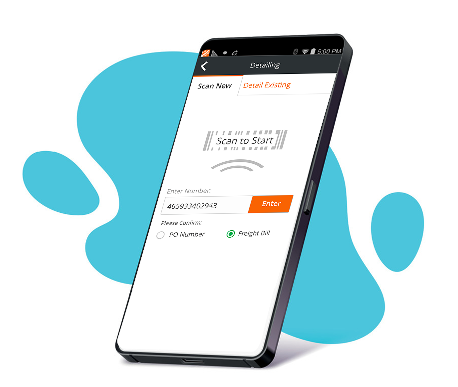
One workflow required associates to step through more than 30 screens on a handheld. The model of the work did not match how receiving actually happens. Extra screens meant labor, error, and distrust of the tool.

Role

Senior UX Designer embedded with a product team that had already cycled through six UX resources. Research in stores (including Sandy Plains and Morrow), prototype evaluation with receiving associates, and design that engineering could ship.

Strategy

  • Test with receiving associates in stores.
  • Collapse the workflow around the real unit of work (freight bill → PO actions).
  • Keep design critique separate from personal critique so the team could iterate under shifting priorities.
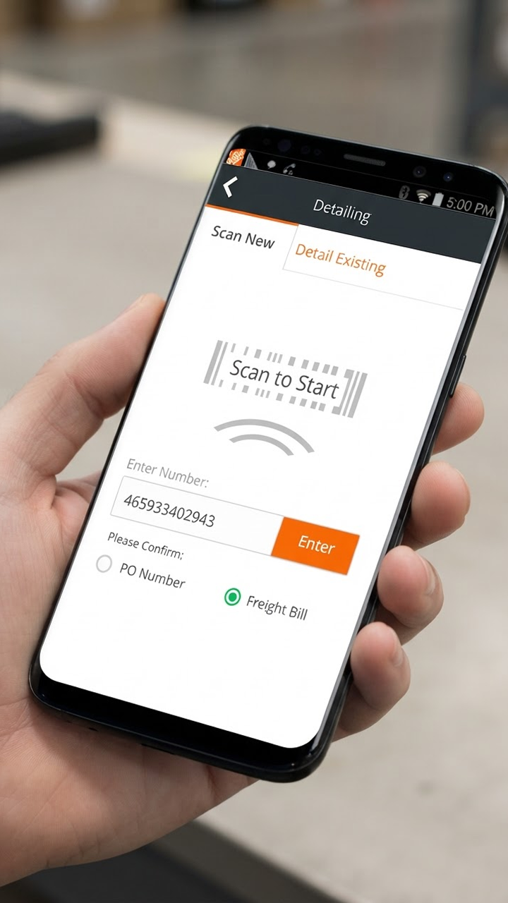
Receiving app on a handheld: scan to start

Outcome

The same workflow ran in 3 screens instead of 30+. Workforce time dropped enough to translate into more than $1.3 million in first-year savings.

She is hands down the easiest person to drop into an existing product team and get results. She is humble in her approach to teamwork and is clear in her role.

Rachel Modugno · Software Engineering Sr. Manager, The Home Depot

I was hired into a Design Operations role that had never existed at Home Depot: no system, no component library, no house for brand standards, no shared critique, and no coherent tooling strategy.

The problem

Without operations, every team picked a tool, every file was a one-off, onboarding was tribal, and procurement was a fire drill. During COVID the org had to collaborate in the cloud, with security and budget still in place.

Role

Staff UX / Operations lead, then UX Manager, Design Ops. Accountable for tooling, system management, people operations for UX, and showing that a larger team paid for itself.

What we put in place

  • Foundational Enterprise UX process as the group grew from 13 designers to 300+.
  • Figma governance through case studies, research, and an explicit strategy. Figma became the sole design tool.
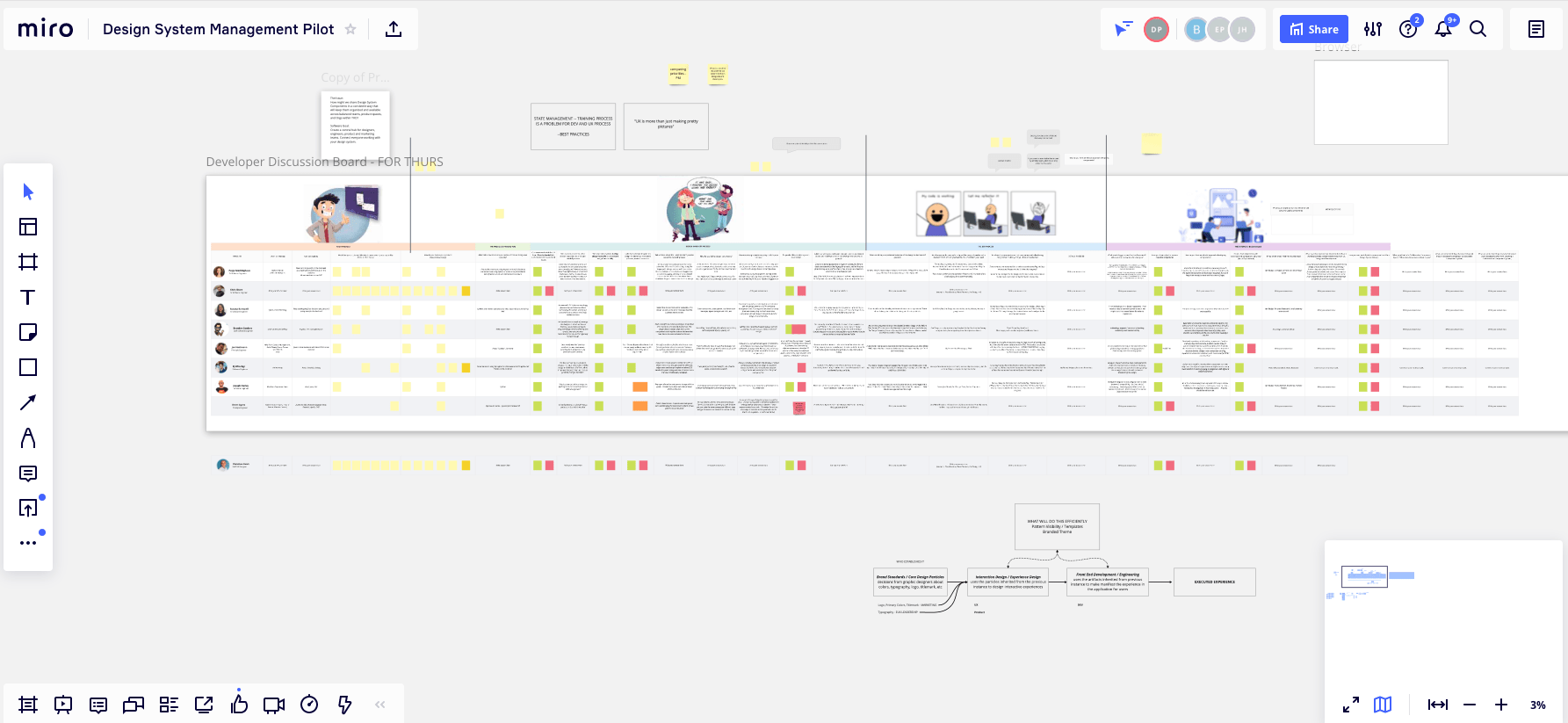
  • The largest design-system management-tool pilot the company had run, comparing Knapsack, Zeroheight, and Frontify.
  • COVID WFH enablement, procurement and security, and an internal UX ticketing flow via Slack.
  • Team growth from 2 to 8 direct reports (400%).
Design system management tooling pilot

Outcome

Design Ops became a standing function. Two DSM tools were selected for Enterprise and Online. The cross-org work led to my promotion to UX Manager of Online UX.